Showing posts with label semi-log plot. Show all posts

25 March 2021

Vaccines, Lock-downs and Passports

 Vaccines, Lock-downs and Passports

Effect of Vaccines

     Our colleagues on the continent seem to be looking to the vaccines as a way of curbing a rampant spread of the virus. It might be worth pointing out that in Great Britain there was no discernible beneficial effect of the vaccination programme on daily new cases; only on daily deaths, which they have enormously reduced. What is needed to curb in infection is stricter lock-down.

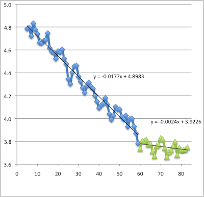
     From 5th Jan 2021 till 28th Feb the semi-log plot of Log10 (daily cases) shows a monotonic decline with a halving time of 17 days. Since 1st March there seems to be a new slower rate of decline -- t(0.5) = 125 days. The epidemiological R number must be getting very close to 1.0. Perhaps this is the result of a return of children to schools,  or perhaps a general relaxation of vigilance; an unexpected negative effect of vaccination. (See my previous posts to understand these calculations.)

Fig. 1 Plot of Log (base 10) of daily case vs Days in 2021.

    I was hoping to see a slowing effect on transmission towards the end of January as the numbers of people vaccinated reached 9 million, but perhaps that was naive. The over-75-year-olds were always taking pretty good care of themselves; so the vaccinated people never were the 'spreaders'. They were, however, contributing to the hospitalisations and deaths. 

     Fig. 2 shows a semi-log plot of the logged death data averaged over the preceding 7 days, in order to smooth out the enormous dependence of number on day-of-the-week. There was a lag during January, while the lethal effects of December and Christmas took their toll. But from the beginning of February there has been an accelerating fall in daily mortality. The March data (pink squares) show a halving time of 11.2 days. And the decline is still quickening.  

Fig. 2. Smoothed plot of Log (base 10) of Daily Cases vs Days in 2021

Lock-downs

     Transmission can be controlled quite effectively in the absence of vaccine, but it takes discipline. If everyone took the precautions that the vulnerable and careful people have been taking for the last 12 months, the daily number of new cases should drop suddenly to zero in the space of 5 - 7 days. Britain has never got anywhere near that degree of discipline. 

Vaccine-passports and Lock-down

     There has been some talk of letting people into pubs if they show a card that confirms that they have been vaccinated. Many seem to favour the idea; many are opposed.

     Once everybody in the country has been offered a vaccination, it does not seem necessary to request a passport. Those who wish to remain un-vaccinate will be taking a risk. But that is up to them. They should pose little threat to others who are vaccinated. 

(See also: Variants of Concern
Covid Epidemiology part 5
Pandemic and new variants
SARS-CoV2 Continued
COVID-19 Epidemiology part 2)
02 February 2021

We anxiously watch for the effects of the Vaccines

  We are very proud of and grateful for our dedicated NHS staff. They are working their socks off to get the two vaccines (Pfizer and AstraZenica) distributed where they will (a) save lives, and (b) bring down the number of circulating viruses.

        I have been following the numbers of new COVID-19 cases reported in the whole of the UK each day on the excellent government website. I plot the logarithm of that number against the day. In December 2020, under a confused and heterogenous tiered system, the virus continued to spread; logged data (pink symbols) rise more-or-less monotonically, with a doubling time of 16.3 days. After Christmas new lockdown was imposed. Since 5th January the logged data (blue symbols) fall more-or-less monotonically with a halving time of 16.3 days. (During the first lockdown, in May and June, the falling incidence showed a halving time of 19.8 days, so this January 2021 fall is marginally faster.)
        Vaccination started at 8th December 2020, but till this time (end January) it has been largely confined to the over 70 age group. It is clear that this group, selected as the most likely to die of COVID-19, are not the group most likely to be the main spreaders of the virus.  
The December data (pink squares) show a steady rise, doubling every 16.3 days (rather ignoring Boris’s lockdowns, letups, and tiers, but maybe showing a slight upward curve as the 'Kent' variant spread.).
        So far, the data for the whole of the UK from 5th January fit a fairly steady monotonic decay curve, t½≅16.3days. (See Fig. 1. Remember, I plot (on the vertical axis) log [base 10] of the number of new cases reported on each day relative to 1st Jan 2021 (shown on the horizontal axis). Blue diamonds are January data to 31st inclusive.) I am sure that everyone is hoping to see a distinct acceleration in the decline of these transmission numbers, but that is not yet visible. 


(The preference for ‘reporting cases' on Fridays is very pronounced — 8, 15, 22, 29 in Jan 2021.)

Of course, the over 70 age group are not the major spreaders, So let 
us look at the Logged (and smoothed) data for the number of deaths on 
each day in January. Unfortunately, there is no convincing sign yet of a 
decline in the daily death toll. The data show only a strong dependence 
on the day of the week. Throughout January, Mondays are good days, 
with 2-3 times fewer deaths than found on Wednedays.


29 December 2020

COVID Pandemic and the New Variant

29th December 2020

Exponential Growth of the Pandemic in Britain

     For the last 30 days (from the 28th November) there has been a steady 'monotonic' rise in the number of daily new cases of COVID reported on the Government site. On a semi-logarithmic plot this looks like a straight line, signifying exponential growth. Throughout December there has been a more-or-less steady doubling time of 17 days. If no change is made to the way we behave, or the virus behaves, this means that the predicted number of new cases in mid-January would be 82,000 per day. 

     In the Figure below, the horizontal axis shows the day (counting from 1st Jan 2020), the vertical axis show the Log(10) of the number of new cases on that day. The Blue points roughly correspond to October, Green to November and Red to December. The y parameter indicates the slope, and R(squared) indicates the extent to which the data follow the modelled line.


     Of course, as every viron has a chance of mutating, and of replicating, twice the viral load by mid-January will mean twice the mutation rate (for good or ill), and twice the growth rate.  (It is perhaps worth noting that the increased rate of propagation noticeable since 1st December is not reflected yet in an increase in the daily number of deaths. Though, of course, COVID deaths will always lag COVID infections by two or three weeks.)

     The Government has made clear their policy on schools: that scholars 'stagger' back and get tested by the 50% efficient 'flow-test'. I would advocate rethinking that, till we can bend the curve back into a falling trajectory. Or at least make non-attendance be an option.

     The Government has also made clear that the vaccine will go first to NHS staff and the over-eighties. I would think the over-eighties are not spreaders.  I would suggest that priority should go to (in order): 

  • NHS front-liners (nurses and doctors),
  • Other front-liners on whom we depend (shop staff, bus-drivers, postal and delivery staff)
  • Others forced by Government into harm's way (scholars, military)
  • Spreaders (compulsive talkers, and social drinkers, and thoughtless people generally)
  • The mobile vulnerable (a sheltered vulnerable is surely at less risk).

     I am aware that the general public have no clue as to who the spreaders are, nor how effective the light mask, and the 'full-kit'. I wonder who has compiled this information and whether it would not be worth publishing. (Please!!)


04 November 2020

Open letter to the PM

Dear Boris Johnson,

I am by no means your greatest fan, but I thought you ought to know that the R0 number is now (3rd November 2020) below 1. That is to say, your 3-tier system has, to some extent, worked. Though it may well be best to stick with the 4 week lockdown-2, already announced. We still have much to learn about hygiene.

In the attached picture I have plotted the logarithms (base 10) of the daily new cases as reported on https://coronavirus.data.gov.uk. The horizontal axis shows the days of the year (day 279 is 5 Oct,, day 294 is 20 Oct., day 308 is 3 Nov.). 


It is clear that the rising line in blue (data from the first 3 weeks of October) cannot be extended through the most recent data (20 Oct - 3 Nov), shown in red.

The rising blue data show a doubling time of 24 days. The least-squares line of best fit is objective, but is not a close fit because of chance vagaries of the data (R-squared=0.62). The falling red data show a halving time of 200 days. (The line is again the least-squares line of best fit). That is to say, in late May 2021 we would still have 10,000 new cases a day (and c. 70 deaths a day) unless we improve our personal hygiene, (or we have a vaccine).  

So the 4 weeks of lockdown-2 should help. In June and July we had 40 times less virus buzzing around, but most people were foolishly unaware that the R0 number was already above 1. (See: https://occidentis.blogspot.com/2020/09/covid-19-case-data-uk.html ). Personal hygiene deteriorated further in early September. 

Yours sincerely, Ian West

---
Ian West
9 Thenford Road, Middleton Cheney,
BANBURY, OX17 2NB,
Tel: 01295 713 889; (Mobile: 07474 572 588)
==================


25 July 2020

COVID is not retreating

Easing the Lock-down-2

(COVID-19 is no longer retreating)

     Using governmental data  for the "new UK cases each day", the numbers have been declining markedly since I started logging them on the 1st of May.  Then we were getting 6000 new cases per day, now only 500 - 700. 
     Now, if there are fewer active cases in the community there should be fewer new cases; i.e. the decline should be exponential, or logarithmic, like a cooling curve.  So, in the Figure below I have plotted the logarithm of the daily increment in UK cases against days (since the 1st of May, so 85 is the 24th July). (A value of 3.0 would mean 1000 new cases per day (1000=10^3); a value of 2.0 means 100 new cases per day (100=10^2).) 
    The data from 1st May to the 24th June are coloured blue, and fit a logarithmic decline. However, the data from 30th June to the 24th July, coloured red, show that the disease is no longer on the decline. We are in steady-state. 
     At the worst there could be a "second-wave", as we have been warned; at the best we shall live like this indefinitely, or until there is an effective and safe vaccine.


Semi-log plot of new cases per day in UK
(See text for details)